
Enjoy.
Advance Wars: Dual Strike / Famicom Wars DS
Japan:
North America:
Europe:

If you ever played Risk or Axis & Allies board games when you were a kid, then this is the game for you.
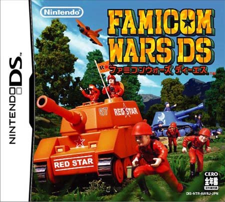
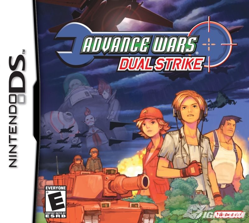
It is nice to see a military game receiving an 'Everyone' rating by the guys at ESRB. Europe however gave it a '7+'. Their reasoning is that anybody under the age of seven isn't well developed to play such an intelligent game, so why bother selling a game that they couldn't play. Apart from that the box art is equal (Nintendo's logo is curiously missing from the EU version). The Japanese version, which retains the Famicom Wars title, features a photograph of a toy-style battle. It is cool but I still prefer both the EU and NA versions.
We Love Katamari / Katamari Damacy Minna Daisuki
Japan:

North America:

Europe:
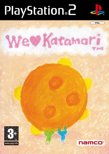
I haven't played this game but I do know that many people really really hate the North American cover. I don't know about you, but all three versions do not appeal to me one bit. A non conventional game with non conventional covers. The Japanese cover even has a giraffe on the freaking roof!
Castlevania: Dawn of Sorrow / Akumajō Dracula: Sōgetsu no Jūjika
Japan:
North America:

Europe:
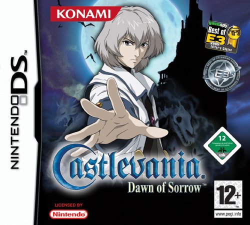
I hate the fact that while the European version has the best artwork, it has the worst design due to the Konami's insistent to stick E3 awards on it and another video game rating (isn't PEGI enough?). This is my pet peeves among media box arts where publishers ruin the art by sticking unnecessary clutter and information. The biggest culprits are book publishers on paperbacks.
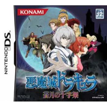
Back to the subject, here we have a cool looking Soma Cruz, whose head is right up in front of a full moon (which gives him a sort of halo look) and they ruined it (grumble). As for the North American version, it contains too many supporting characters. The Japanese version though still using the same image as the North American version, has a huge full moon and features an uncropped Soma Cruz. Probably the best design here, but I still lament the fact that the EU design was wasted for some E3 awards.
Resident Evil 4 / Biohazard 4
Japan:
North America:

Europe:

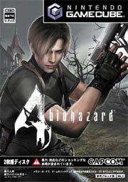
Firstly this is a fantastic game. If possible get the GameCube version as the graphics are superior to the PS2 version.
RE4 European PAL version beats both the Japanese and North American versions hands down. It is simple and doesn't feature a gun on the front. The Japanese version (known as Biohazard 4) features only the floppy haired Leon, which me thinks is better than the Dawn of the Dead inspired look of the North American box art.
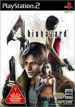
PS2 versions:
Japan:
North America:

Europe:

I will go on record to say that Europe wins once again. It isn't as nice as the EU's GameCube art but it is close. Both NTSC versions received horrible box arts.
Viewtiful Joe: Double Trouble / Viewtiful Joe: Scratch
Japan:
North America:
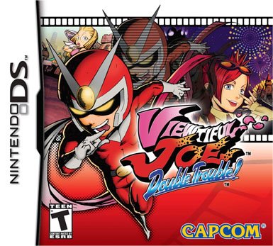
Europe:
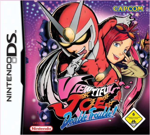
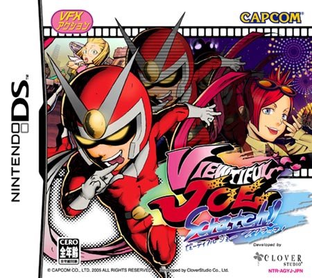
The Japanese and North American version share the same box art although the Japanese version is littered with rubbish everywhere. The European box seems to be more colourful, probably due to the shades of purple and pink. The film cell reference is also missing. I prefer the North American version because that is the version I own. ;)
Nip/Tuck Season One
North America:
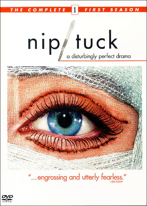
Europe:
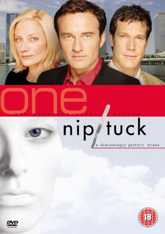
This isn't only about games. DVD boxes vary greatly among territories and regions. I am using Nip/Tuck as an example because the differences are enormous. I searched high and low for the Japanese box art but couldn't so these two will make do for now.
I love the UK box art, but after seeing the North American box art, I am like wow, the UK version sucked so much. To be fair, the American version, at first glance didn't look that great (it looked 80s) - until I saw the stitches over the eyes which says a lot about what Nip/Tuck is all about. The UK box however features the three protagonists on the front, probably to convey that Nip/Tuck isn't only about plastic surgeries. It is about the surgeons. Needless to say both are pretty good boxes, I just prefer the US version more.
More on box arts by GameSpy: Top 10 best box art and top 10 worst box art.
Technorati tags: Box art Castlevania Advance Wars Katamari Viewtiful Joe Nip/Tuck
3 comments:
Ico.
man... u do like games don't u ? :P
Anon: Yes like Ico. But everyone has talked about that so I will leave it.
Ken, always did, much like I love indie rock and like you anime/manga. To tell you the truth I grew fed up of gaming in 2001. I couldn't stomach all the rehash generic FPS and what have you. But like many old timers who grew up in the NES era, the DS/Mario Kart finally brought me back to gaming for the only one reason - fun games. No more competitive shit.
Post a Comment