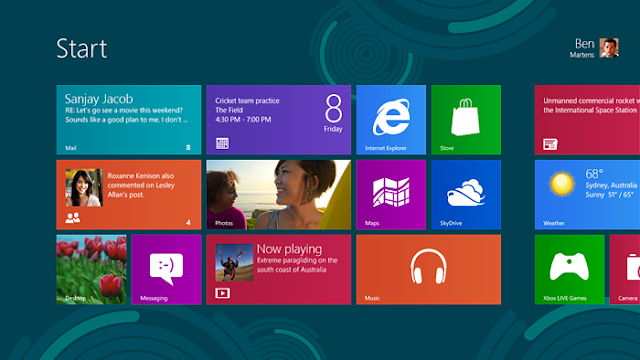
In what can be only be described as a ridiculously long blog post Microsoft has detailed the desktop mode of Windows 8 and how it will differ from the glossy effect-driven Aero-look as seen on Windows 7. With Windows 8 set to a tablet-driven interface, there has been concerns raised that Microsoft would do away with the desktop mode altogether. After all, while Metro is pretty - it isn't exactly the most intuitive UI for keyboard + mouse PCs. Due to the need to maintain usability on desktop, the need for a classic mode was always going to be important.
But the move to flat, minimalist Metro UI would mean that switching between the two modes would be jarring. Microsoft has addressed this by Metro-fying the desktop mode. The much disliked Aero Orb Start button is now gone replaced by the Metro start interface. I am also glad to see all the gloss, fake 3D effects, and unneeded effects gone. Shadows and transparency effect (which any sensible person would have turned off on older version of Windows anyway) has also been consigned to history, and the use of gradients has been scaled back, reaffirming Microsoft's new design commitment to simplifying the UI and removing unnecessary effects. Even rounded corners weren't safe from the cutting floor.
The move to using a flat visual style reminds me of BeOS, a Windows alternative that I admired before they were bought and killed off by Palm. It too featured featured a flat minimalist interface, sharp edges and simple hues. The new taskbar and title bar are now cleaner, removed of distracting elements. However I wold like to see Microsoft go further and design new simplified icons. Perhaps Microsoft aren't too keen of taking a big chance with the desktop mode for fear of alienating people resisting change. I still live in hope that Microsoft will go all the way by removing any visual elements introduced with Windows Vista.
With Windows 8 RTM a couple of months away, we will find out soon enough. I do not think I have ever been this excited about a new Windows OS since the release of Windows XP in 2001. With the introduction of Metro UI and the simplification of desktop classic mode, I honestly can't wait to get my hands on it. Bring it on says I!


No comments:
Post a Comment