
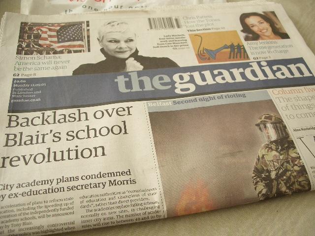
The Berliner (nick-named after a German paper who also uses the same size format) is unique in its size because it is halfway between a tabloid size and broadsheet size. Ideal for people who does not want to read
With the relaunch The Guardian also revealed a new design direction, ditching the recognisable design from the 80s. Every single page will be printed in colour too.
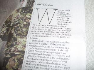
A close up shot of the paper reveals the new font used by The Guardian. It is called the Guardian Egyptian which is the same font used for the title head.
supplements included the usual Sport pages (with minimum 12-pages everyday says the editor) and MediaGuardian. Both are also printed in the Berliner format. G2 magazine comes in half the size.

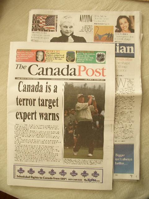
I do not have a reference national tabloid to compare with so here is The Canada Post, that happened to be lying around, on top of The Guardian:
I like the new size. Not so sure about the design as I have grown fond of the David Hillman design. But I am sure I will get used to it. The new font is as easy on the eye as the old ones.
2 comments:
So that's what it is. Saw it this morning, thinking that it's a foreign paper.
My newsagent sells only Asian foreign papers along with local & national prints. So lucky for me!
Post a Comment